1. Colour for text and background
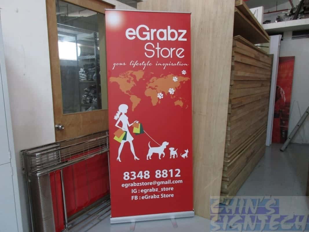
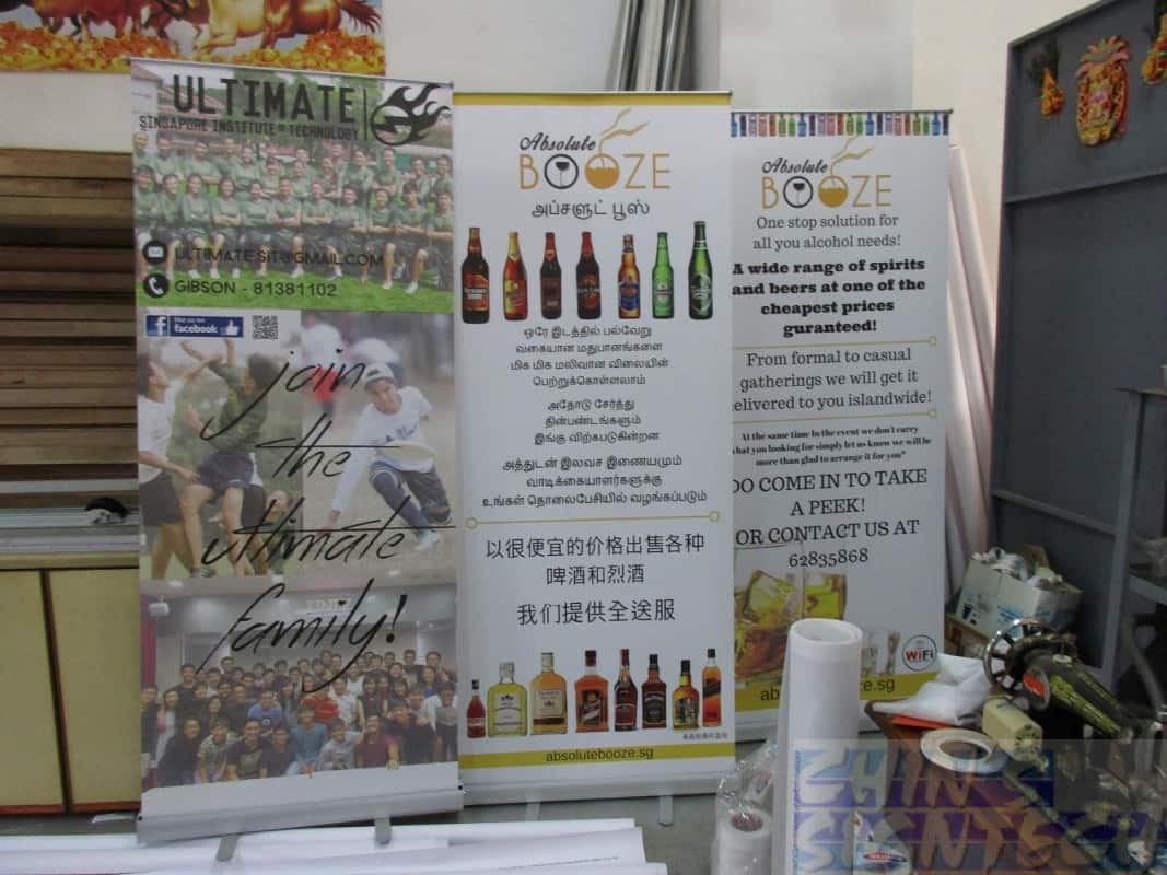
Color is key in design. You can’t ignore it if you want a roller banner that effectively shares your message. There is nothing to be gained by just picking any arbitrary color for your design and going with it!
A good color scheme helps you stand out. It should match your corporate style and not clash with your logo. Plus, you have to think about how readable your text will be on top of the color background. Bright yellow letters on a white background look striking, but they’re hard to read.
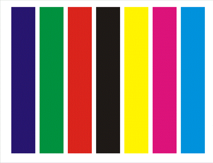
Choose simple colors like red, dark green, blue, or black. These are the best options for your poster printing. These colours contrast well and easily on any colour background.